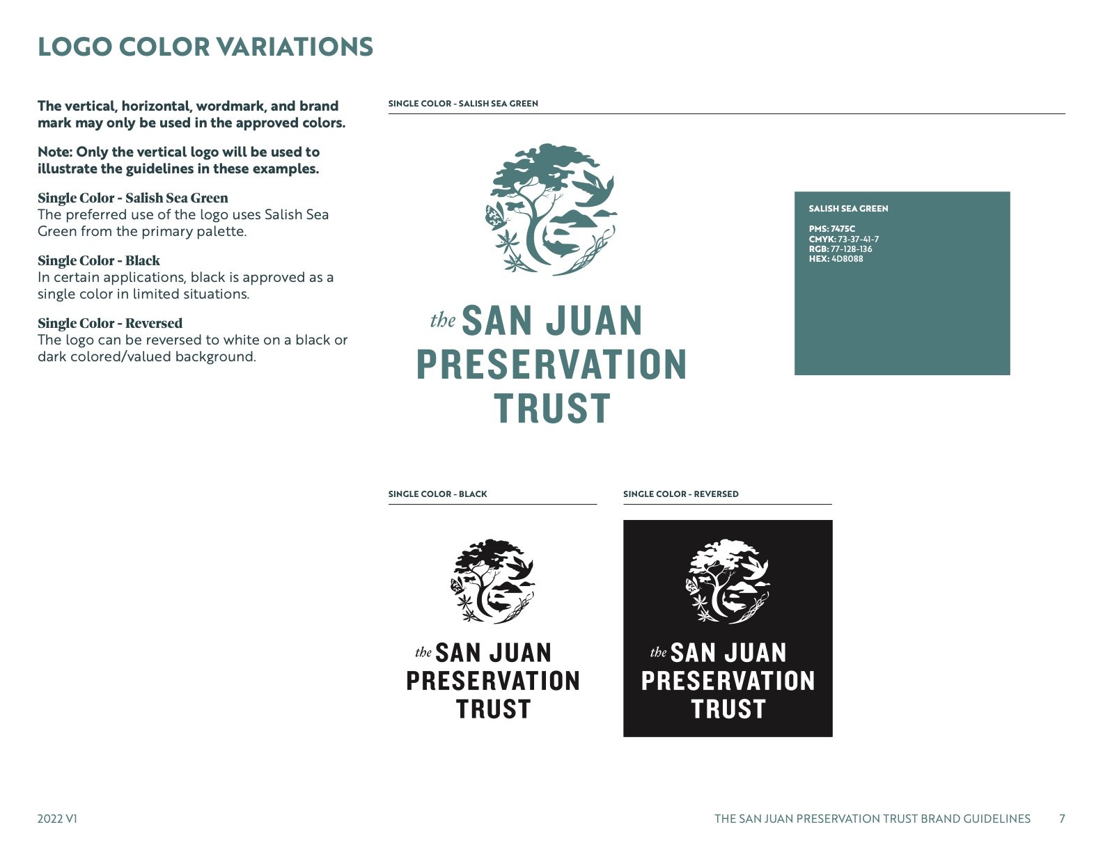
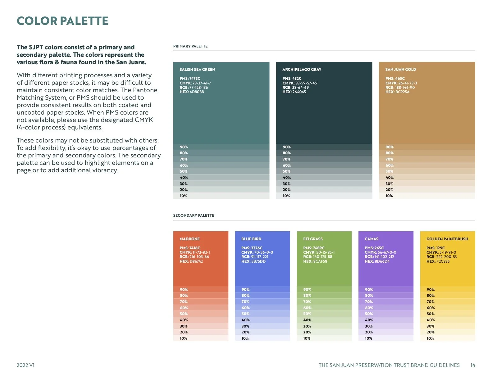
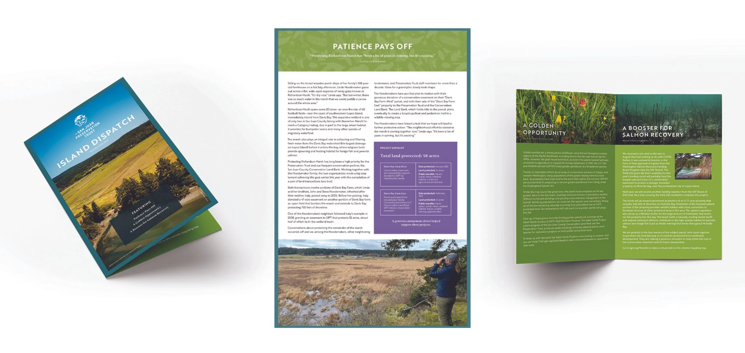
The San Juan Preservation Trust aimed to modernize its brand identity and I had the opportunity to work with a talented team to bring this to life. We updated the color palette to vibrant hues, redesigned the logo for a more iconic look, and introduced contemporary typography. These collective efforts successfully refreshed the brand’s image and strengthened its appeal.
Previous logo
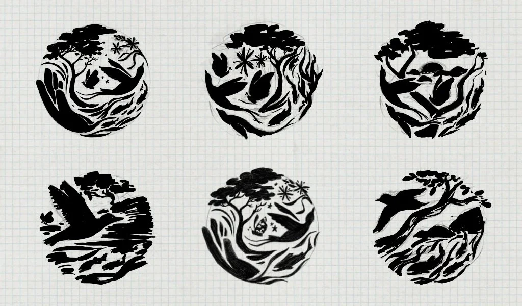
Sketch explorations
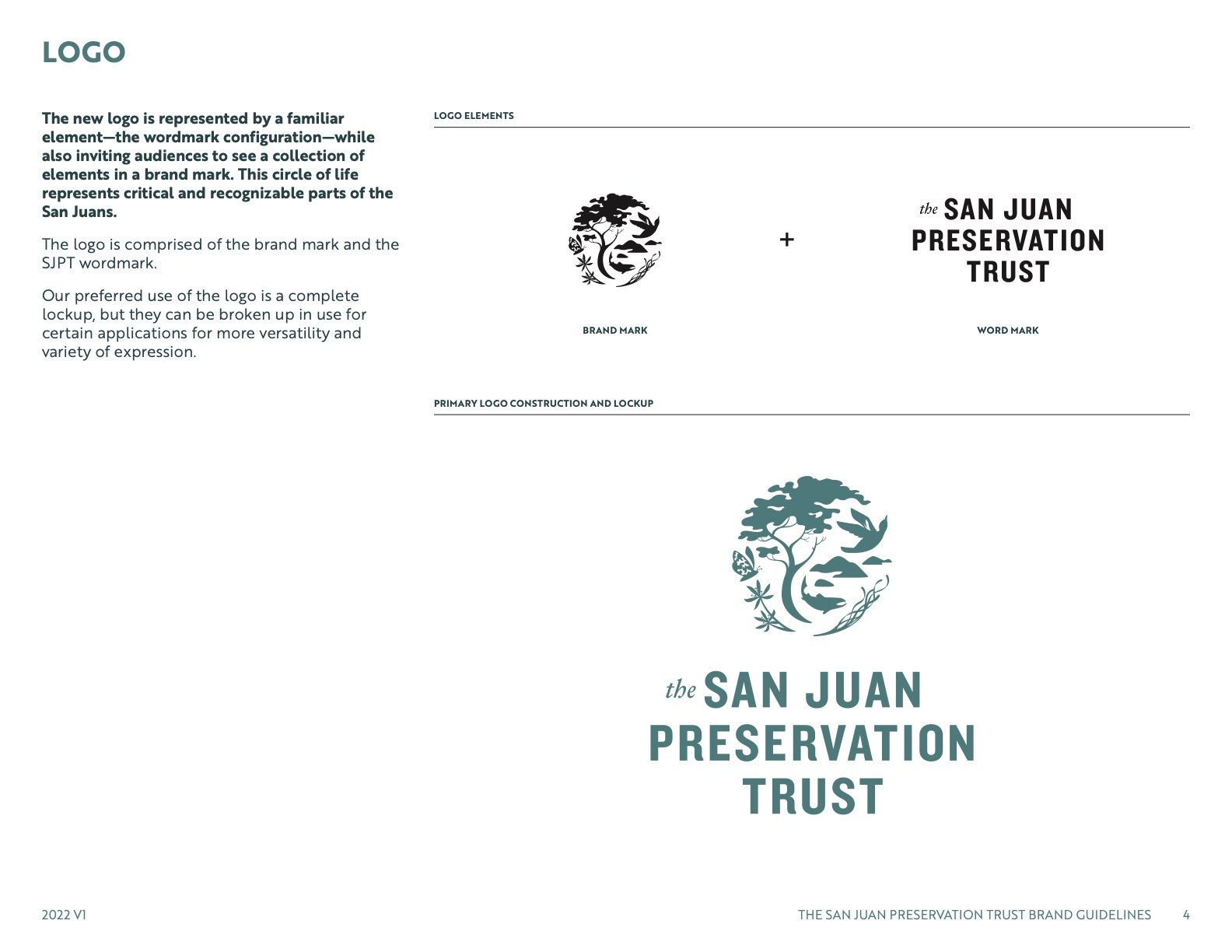
Final logo mark design - each element in the mark represents a unique flora or fauna to the San Juan Islands.
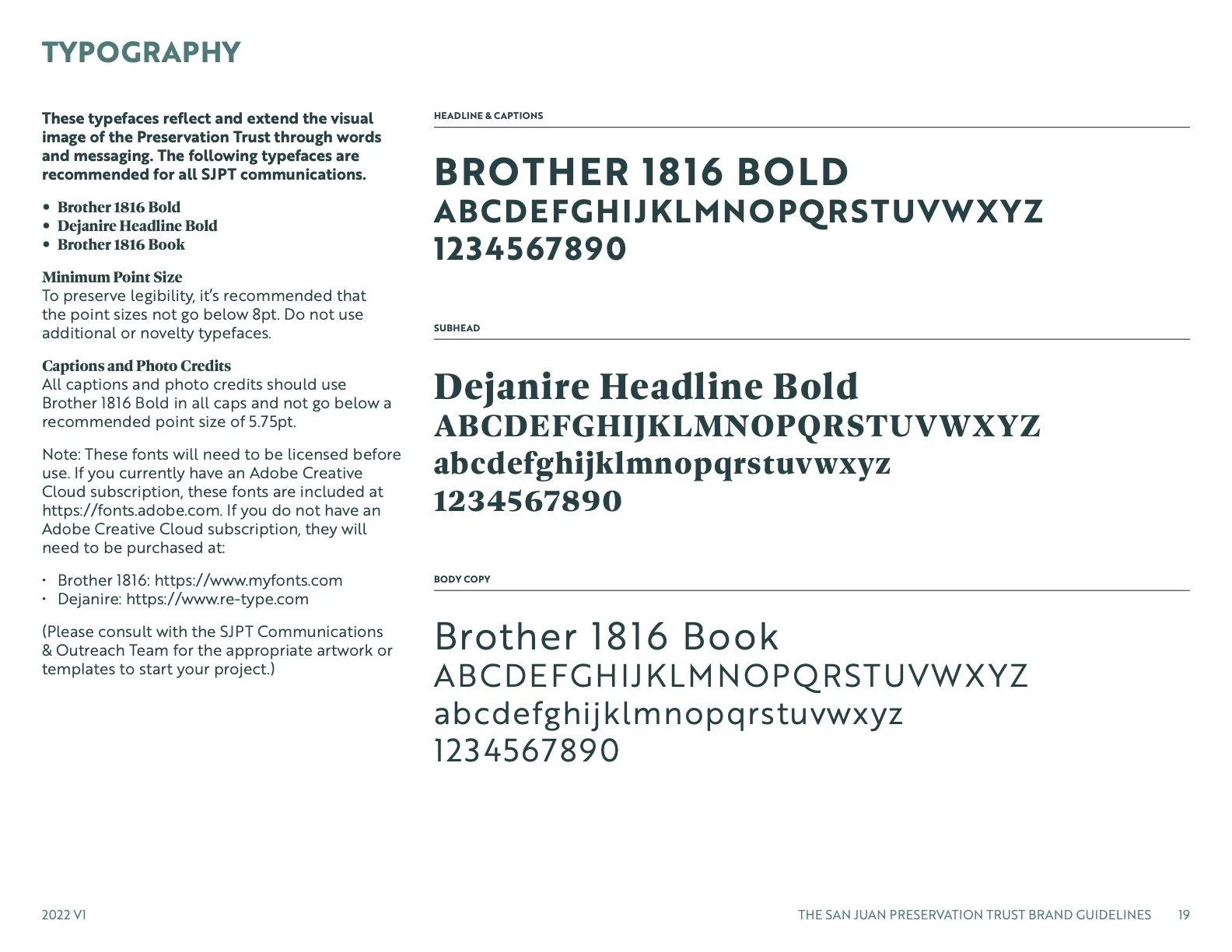
Logo mark + typography
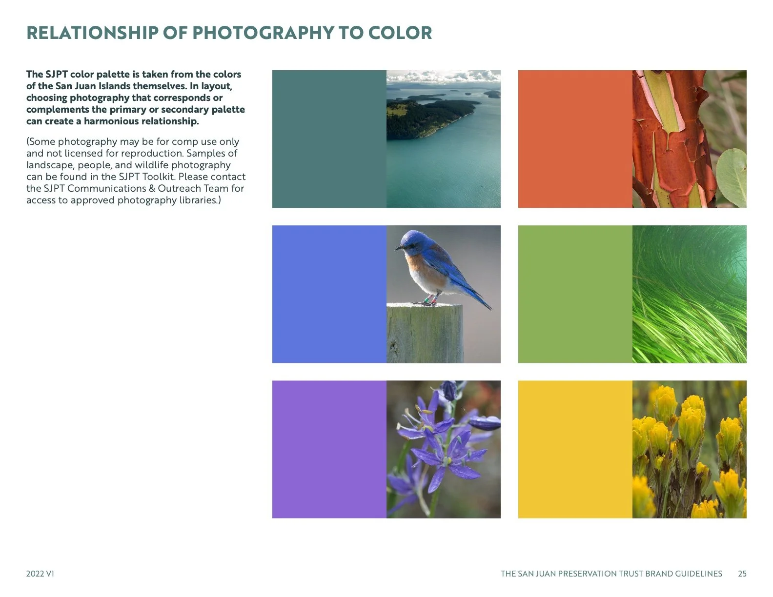
New colors were chosen based on locations and the natural surroundings of the islands.
Flora and fauna patterns created that can be used as backdrops for headlines.
A set of brand guidelines were produced to ensure consistent usage of design elements.

